Survival Analysis
The cancellation of accounts provides a direct application of survival analysis. This kind of analysis is usually used to estimate customer lifetime values. In this framework, customers are considered to have "died" when they cancel their policy, and the patterns in claims indicate whether the customer is alive. For example, a customer who regularly makes a claim every 2-3 months for years is probably still around if their last purchase was a month ago. A customer who set up their policy, make a bunch of claims, then went quiet for a year-less likely "alive". We use the lifelines and lifetimes python packages to assist in this analysis.
We will utilize 3 traditional features for this analysis:
- Frequency-The total number of claims - 1
- Recency-The time difference between the first and last claim
- T-Equivalent to the lifespan variable, total age of the account, or time between the cancel date and enroll date if canceled.
Survival analysis gives us an opportunity to predict future claims.
Figure 1 shows the expected number of purchases/day, as a function
of frequency and recency. Broadly speaking, only high recency
(indicating purchasing over large time frames) leads to a likely
to continue to make claims. A high frequency further increases this
likelihood, however recency is the dominating factor.
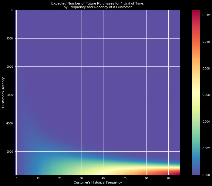
Figure 2 shows the likelihood that a customer is "alive" given purchasing
habits. Clearly high frequency and recency indicate an active and happy
customer that will keep returning, but we see that even a low
frequency customer with low recency stands a good likelihood of being alive.

To see how this behavior changes over time, we can watch the likelihood
of being alive for a few individual cases. In Figure 3, we watch the creation
and "death" of a policy. We see when the account is created, the policy
is definitely alive (P=1), and shortly claims are filed. Each time a claim
is filed the likelihood of being alive jumps higher, however the likelihood
of the policy remaining alive decays. After June 2016 the frequent purchases
stop, and the account seems to have died. This is followed by a spike
in purchases, increasing the recency and frequency-until the last claim,
when the account looses activity, and the policyholder becomes very likely to leave.
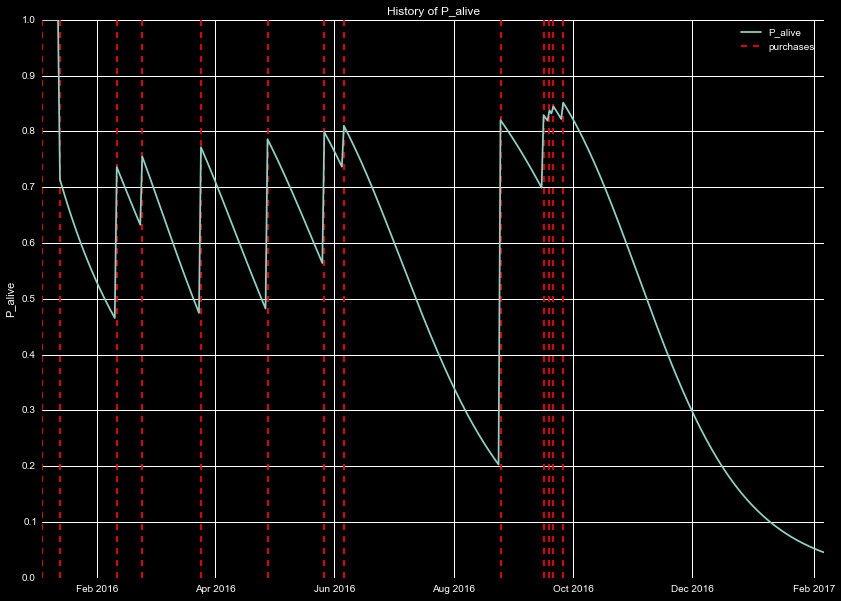
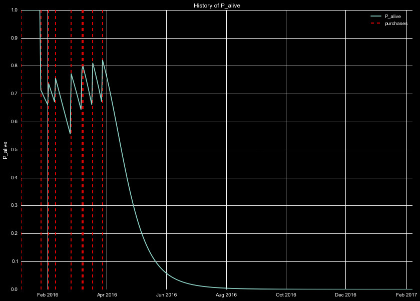
Figure 4 is the same as Figure 3, but for a different policy. This one is
in stark contrast to the behavior in 3, where the policyholder
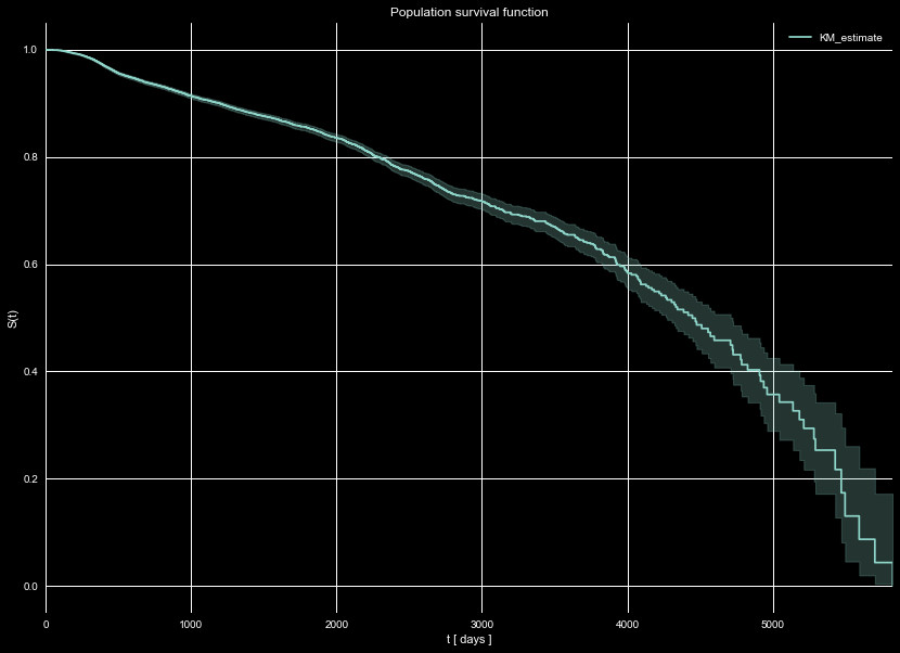
Next, we look at the survival function of the entire population, S(t). The
survival function is a measure of the the number of policies that "survive"
until time t. This is important due to data censoring, or the effect where
we will see some cancellations, and not others, due to the time limited
nature of our data. Any policies that have not canceled by the end of our
time set (that we are predicting the cancellations for), are considered
right-censored. The survival function is calculated at each time by examining
the number of policies that were alive at time t, and the number that
canceled at time t. This is a way to include the censored data, and include
it into our analysis, despite the fact we do not see their cancellations.
We show the survival function of our entire population in Figure 5, using
the Kaplan–Meier estimator. We see that half of the policies are expected to
survive to the 12 year mark (~4500 days) from the provided data. Note it is entirely
possible that this does not reflect normal behavior, depending on how the data
set provided was selected. We already saw cancellations were limited to 2016,
so there may be unknown, hidden biases in the data. That notwithstanding,
this is the expectations we have for our population to survive past a given time.
Survival functions are powerful tools, they can be used to estimate policy
lifetimes and customer lifetime values. Some estimators even allow for
the creation of individual survival curves based on the input features. In
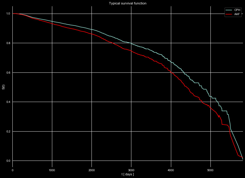
Figure 6 we show an individual survival function for a typical policy
(recency of 130 days, frequency of 3), using two different estimators.
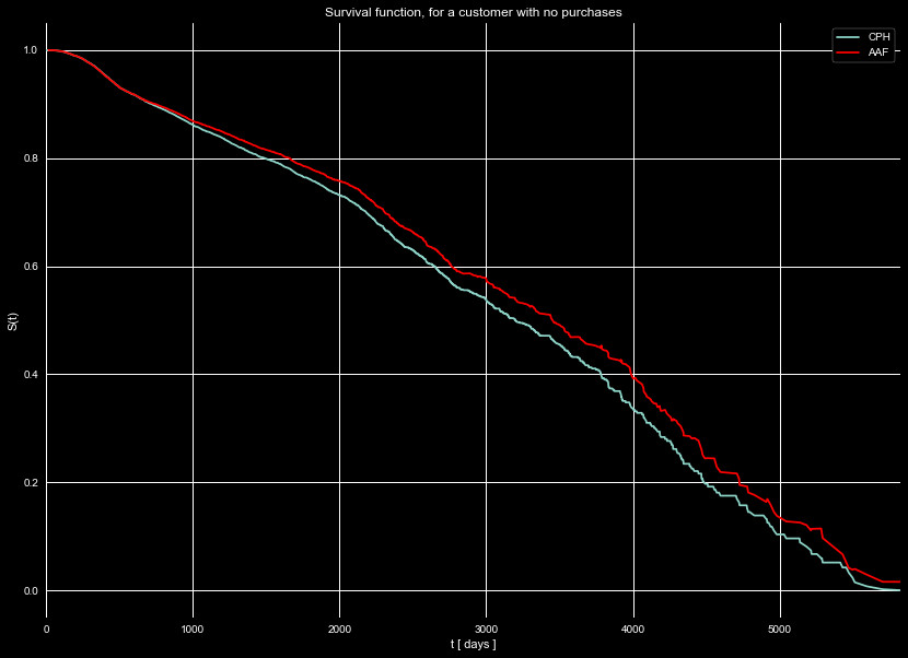
Figure 7 shows the same estimators, but for a policy with no purchases.
Note how policies with purchases tend to last longer than policies without
purchases.
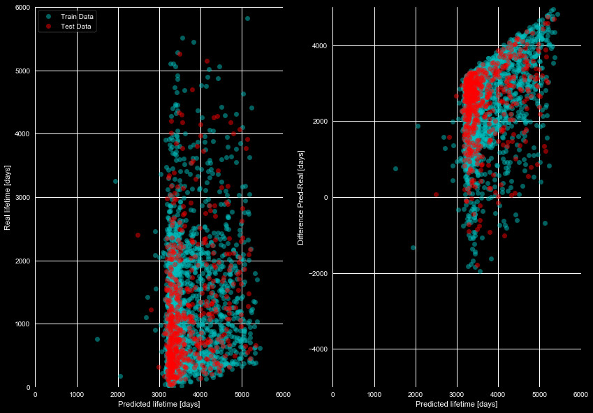
We see these policies have a long estimated lifespan. In fact, attempting
to estimate the average lifetime of just about every policy gives something
in the thousands of days, and the survival functions fail to estimate the
lifetimes. We plot our attempts at this in Figure 8, which compares the
real lifetime to that predicted from the survival functions. If there was
even a rough linear correlation we could say this model could be useful, but
it clearly fails to predict the lifetimes.
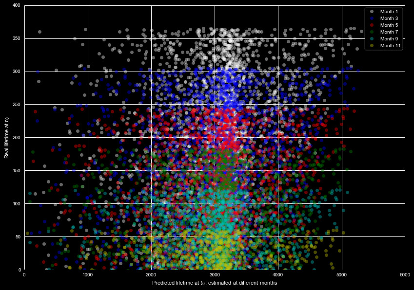
The above prediction is for the total lifetime. It's reasonable to expect
the largest uncertainty when predicting such a large value, so maybe it would
be more reasonable to estimate the remaining lifetime from the survival function.
We show this in Figure 9, which shows the real remaining lifetime, and
predicted remaining lifetime, for different months using the test data set.
A keen eye may notice the predicted values only slightly shift from month
to month. This is clearly another failed attempt to predict the lifespan.
We took this survival function, and tried predicting the likelihood of canceling
in certain months. This is found by integrating over the survival function in the
time frame of interest. This provided little help, as the survival functions predict
a less than 5% chance of cancellation for all policies, for all months. Clearly this
functions fails. The methods for analysis are simple so this does not seem to be in
the implementation.
This may be due to the approach we are using. Lumping all the data into one model
may be erroneous. We have two sets of data that may demonstrate different behavior.
Roughly a third of the policies have filed claims, with the remaining have never
filed a claim. If these demonstrate different behavior, it may cause the predicted
lifetimes to be off. We thus break our data set into two different sets, those with
claims filed, and those that don't have claims filed, and plot the predicted lifespans
of the two sets in Figures 10 and 11. The models were trained on 80% of the data
in both cases, and predicted on 20% of the holdout (predicting only on data we
see the cancellation for). We see with this split,
the Aalen Additive Fitter struggles, but the Cox Proportional Hazard Fitter performs
relatively well over the whole range in both cases.
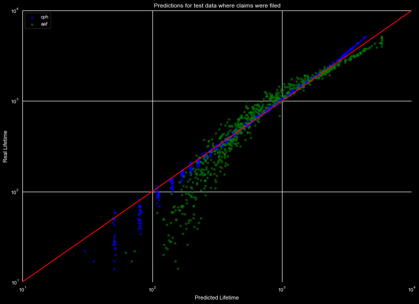
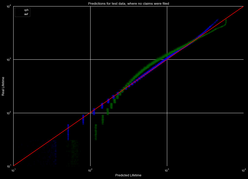
We see that splitting the data, and then modeling it, causes the predicted lifespans
to drastically improve over the group set. We will compare these models to a general
machine learning model, in our results section. First, we must generate our
Machine Learning Model.