Feature Scaling
It is always useful to visualize and explore the data
before performing any modeling. We combine the exploration
and data scaling in this section. Scaling is very important
for many machine learning algorithms, so we will scale all
of our continuous variables. We focus the scaling analysis
on the data we trained our models on, to avoid biasing test
results.
I focus in this section primarily on the distributions of the features,
rather than correlation or scatter plots between trends. Quote information
is incredibly noisy, and attempts at these lead to one of two things:
either plots showing little to no correlation due to daily noise, or
apparent high correlation, as the market is always tending towards an
overall increase, and all trends point this way. We will save examination
of trends for the analysis section.
diff_co
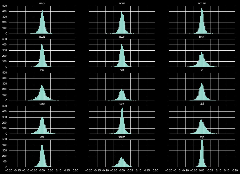
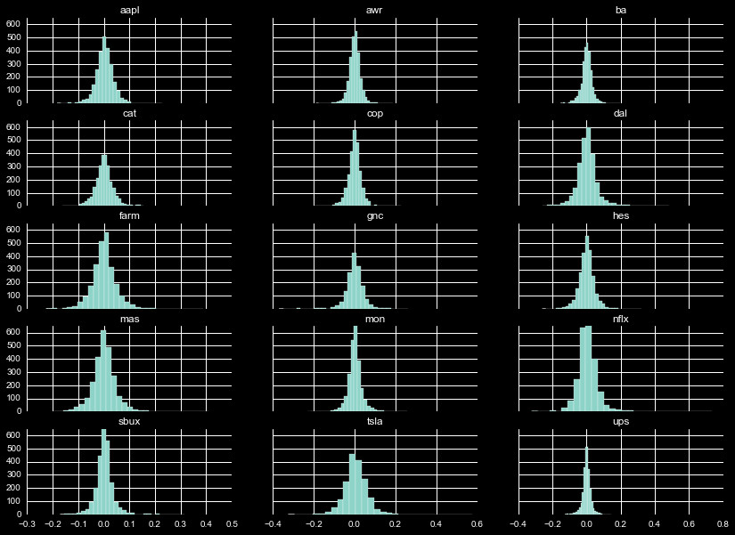
We will start with the percent difference between the closing and
opening price for the day, denoted diff_co. We display the histogram
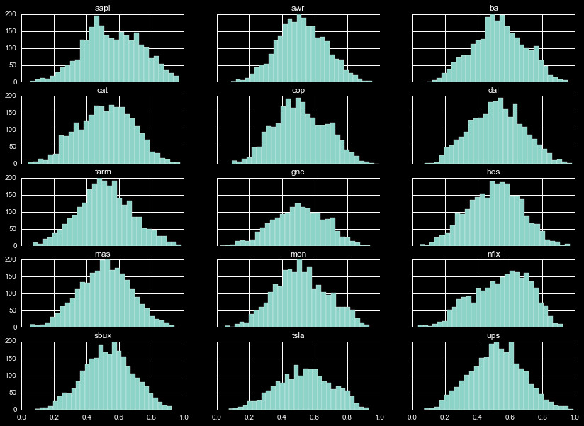
of this distribution in Figure 1. Examining a few cases, we see
FDP is almost entirely contained within ± 5%, whereas BA is
spread to within a ± 10% range.
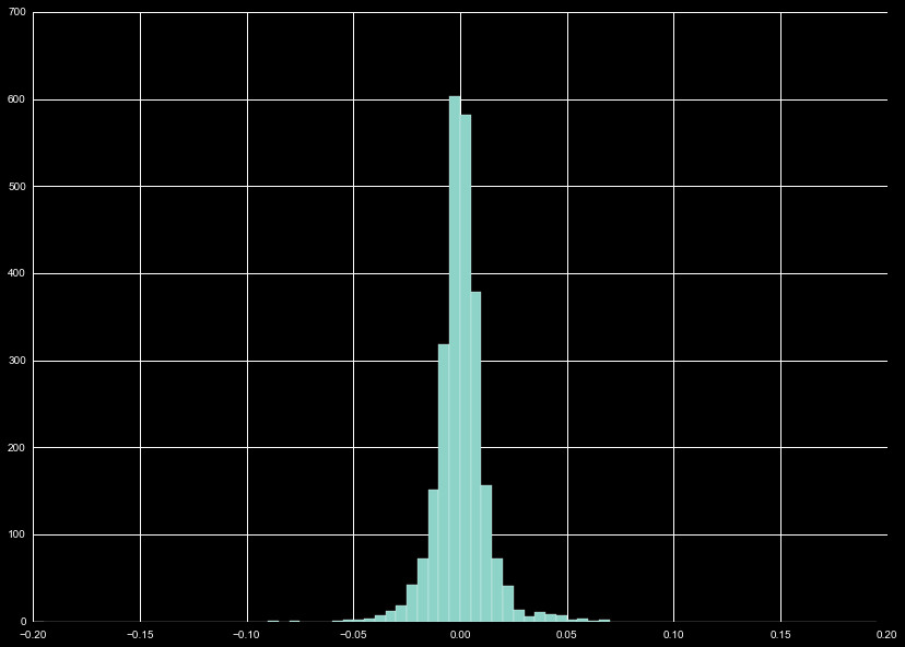
With all these different distributions, it is useful to look at the
combination of these distribution, as we do in Figure 2. We wind up with
a normal distribution, with the bulk of the distribution falling within
that ± 5%.
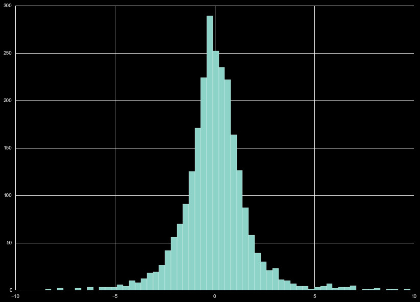
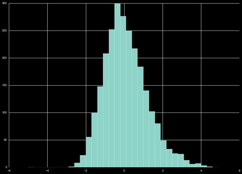
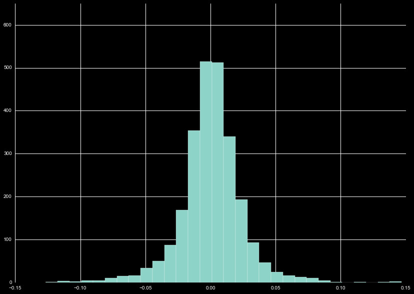
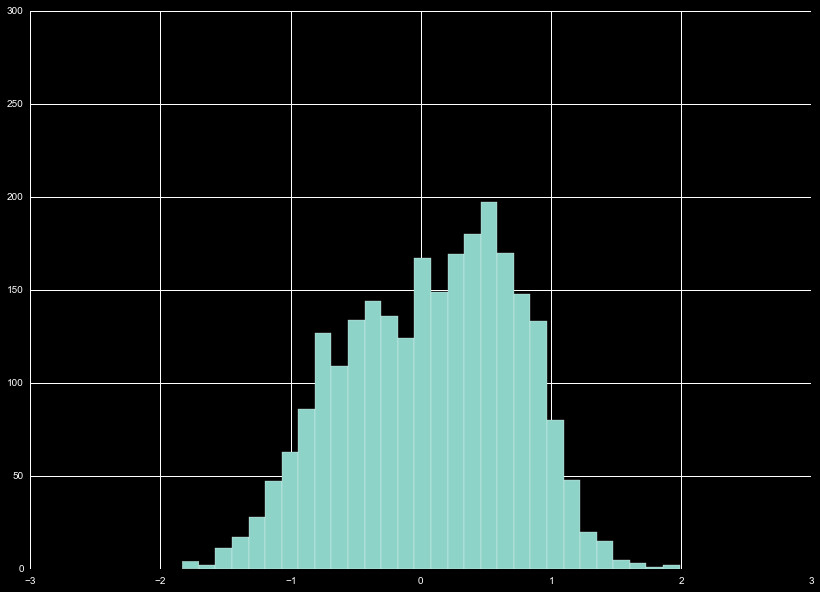
The distribution of all the diff_co values show a clear normal
distribution. We perform a z-scaling on the normally distributed
data, as seen in Figure 3. The scaling performed is a custom scheme,
where we omit data points on the furthest extreme, and renormalize.
This is repeated until the new fits perform minimal change in the
distribution.
diff_hl
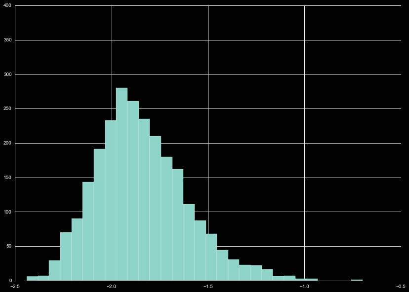
Similar to the analysis we performed for the difference between
close and opening prices, we generated a feature for the percent
difference between daily high and lows, diff_hl. The distribution of
values is exclusively negative by design, and skewed towards higher
diff_hl, as can be seen in Figure 4. We perform z-scaling
on the diff_hl, as can be seen in Figure 5.
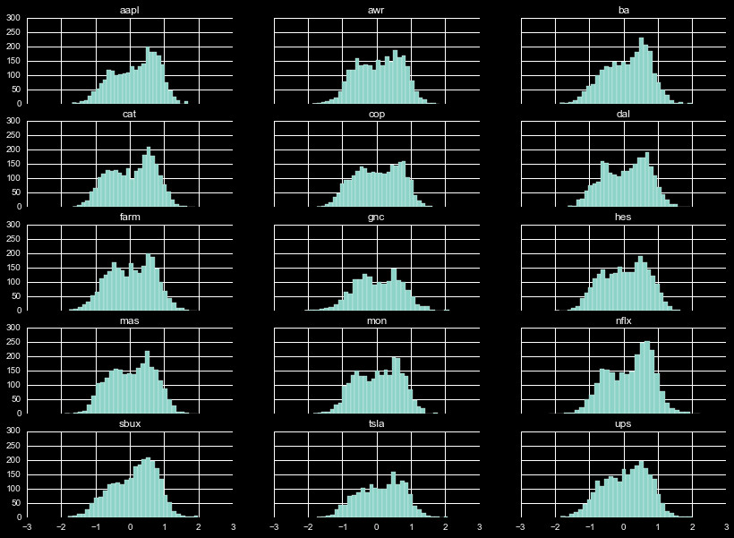
Momentum
The distribution of momentum, as with diff_co and diff_hl, varies greatly
depending on the company. This can be seen in Figure 6, which shows the
3 day momentum of the percentage of the closing price (arguably the shortest
possible momentum measurement).
Again, we combine the momentum distributions (Figure 7) before z-scaling the data.
Bollinger Bands
The Bollinger Bands have a unique distribution. Figure 8 shows the distribution of
the daily value relative to the 25 day mean bands. A value of 1 (-1) indicates the
daily close is at the upper (lower) band. As can be seen, there is typically a double
peak in the distribution, with significant variation in the shape of those peaks.
Combining these distributions, we see our first significantly non-normal
distribution in Figure 9. We decide to use a unique scaling for the Bollinger
Bands, with uniform treatment for all band windows we utilize. We z-scale using
a mean of 0, and standard deviation of 0.65 across all bands we choose. This
was selected by calculating the standard deviation for the distribution, and modulating
the scaling value so roughly 95% of the data was within 2 standard deviations.
A non-traditional z-scaling, but more than sufficient to fill our scaling needs.
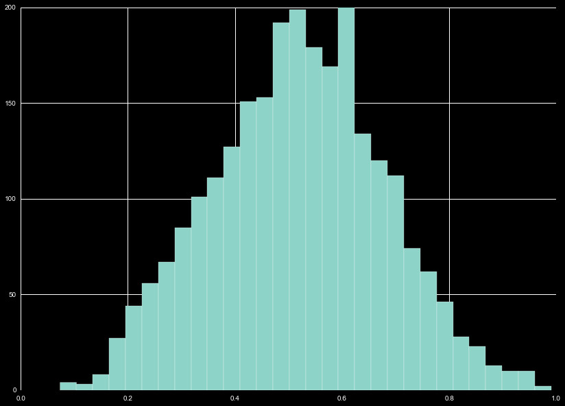
Relative Strength Index
The Relative Strength Index gives a measure of the total gains in the closing
price, relative to the total losses in the closing price, over a window of time.
The simple mathematical form of this is
RSI = 1 - 1 / ( 1 + A / B )
Where A = average gains in window, and B = average losses in window. Due to the
nature of this definition, there is a hard cutoff at 0 and 1, with values typically
winding up around 0.5. We show a 15 day RSI in Figure 10 (typically 14 days is used).
We combine the distributions in Figure 11, and the cumulative distribution almost
resembles a normal distribution.
Like the Bollinger Bands, this requires a unique normalization. We could perform
a min-max normalization, bringing the distribution from -1 to 1, but given the
shape of the distribution it seems appropriate to perform another custom z-scaling.
Fitting 95% in two sigma, we use a mean of 0.5 and standard deviation of 0.2 to
z-scale all RSI features.
Log Closing Price
Finally, we perform another custom normalization for the base 10 logarithm
of the closing price. The closing price lies between $10 and $1000 for
almost all common stocks, and for everything in our distribution. This places
the log between 1 and 3, so subtracting 1.5 puts most our log prices between
-1 and 1. With this I play more loosely, as this will most likely serve as
a damping term, where more or less expensive prices lead to steeper or
flatter trends.