Filling close values from rolling means
Interpolation Scheme
We now have predictions for the rolling means, of days 3, 5, 8, 10, 15, 20, 25, and 30. As the quote are only for weekdays, this puts our predictions at a little over a month out. To generate predicted close values, we can use the knowledge of the most recent close, the subsequent rolling mean, and the rolling means afterwards to estimate the closing price for every day.
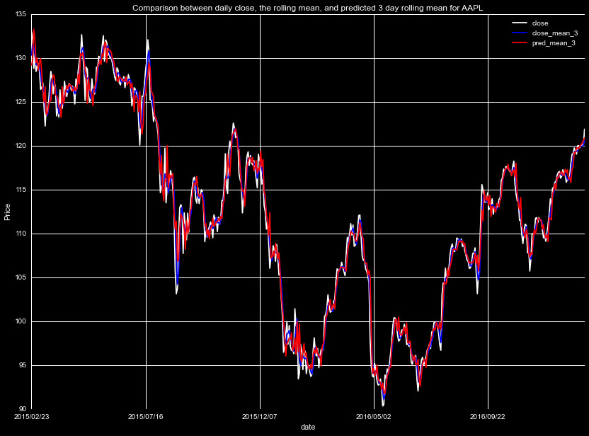
Starting with the first block, the concept is simple-between the closing value, and the predicted 3 day mean, we know what the average value must be between those days. We start by placing the middle day in an N day window at the predicted mean value. Then from the low endpoint, we set the high endpoint so that (high+low)/2=mean of the chunk. With the low, high, and midpoint set, we use a cubic spline to interpolate the rest of the points. We later introduced a tuning parameter, designed to pull the endpoints closer to the weighted mean to smooth the curve, after finding the predictions had systematic jumps at the endpoints.
This method provides a smooth curve, approximating the trend of the
prices with good accuracy. As a demonstration of this process, we plot
below in blue the actualy closing prices, and in red our interpolation
scheme for the true rolling means (before the tuning parameter introduction).
We by no means expect to match the day to day trends, but look to capture
the underlying trend.
Smothing Noisy Predictions
With the interpolation scheme up and running, we now would like to
implement it on the predicted rolling means. Unfortunately, we
require a few more steps before we can begin the interpolation.
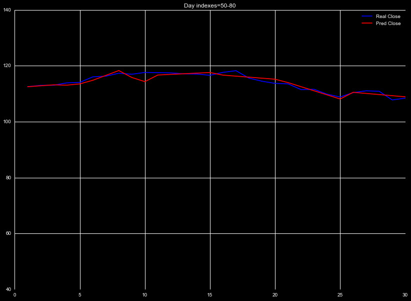
To see why, let's examine the output of our preditions. Figure 3
shows the predicted 3 day rolling mean of the data, compared with the
true 3 day rolling mean, for an arbitrary window of time. Without
introducing any metrics, we can see the predictions (red) generally
match the true trends (blue).
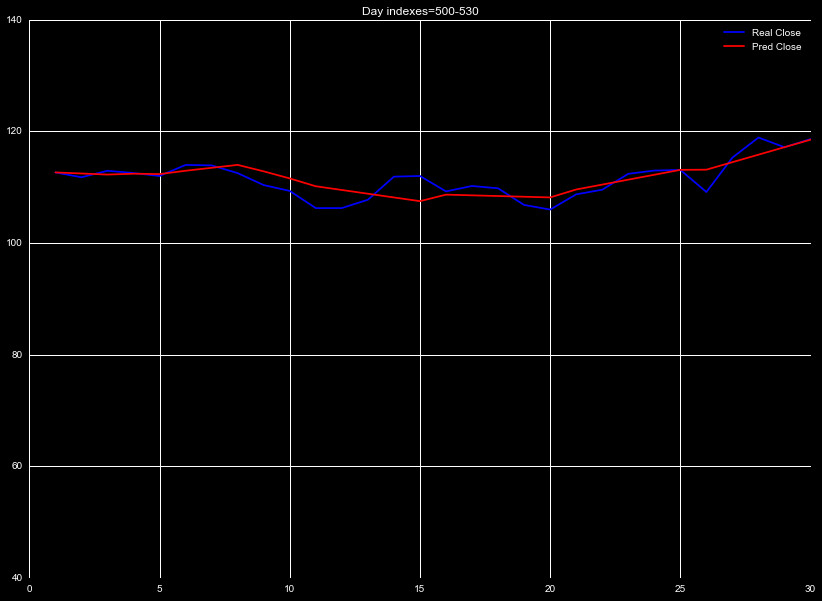
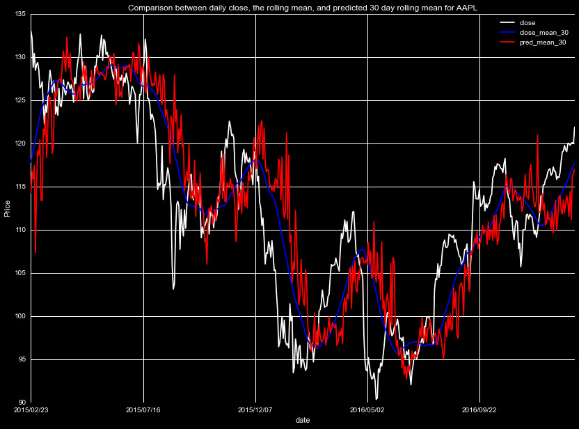
If, however, we look at the 30 day mean, as in Figure 4, we see
there is a huge contribution due to noise in the predicted 30 day mean.
The noise is worst at the largest rolling mean, but becomes significant
around the 10 day prediction. If we perform the interpolation using
these values, the noise will cause our predicted values to vary wildly.
To adjust for this, we can smooth the data, by taking a rolling mean
over a number of previous days to smooth out the noise. While this
constricts the number of days we can make predictions over, it greatly
removes the uncertanty of the predictions.
We introduce smoothing and shifting on the predicted rolling means,
choosing parameters that minimize the standard deviation in the
fractional deviation, given by pred/true-1. We show some of the
new predictions in the below figures. The left panel is as in
Figures 3 and 4 above, with the white line indicating the close
price, blue the true rolling mean, green the prediction from our
Adaboost Regressor, and the Red our new prediction, after smoothing
and shifting. The right panel is the difference between predictions
and the true rolling mean, with the prediction's means and standard
deviation on top, for both the Adaboost prediction and new adjusted
predictions.
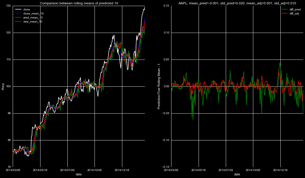
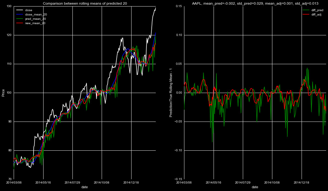
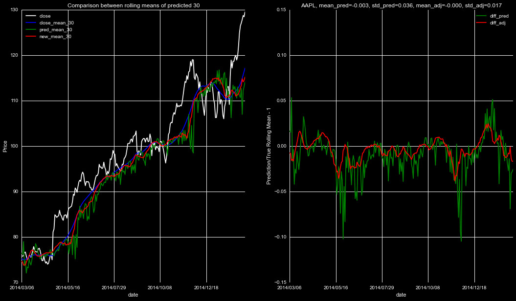
As can be seen from Figures 5-7, this smooth and shift technique is a significant
improvement from the predictions themself. Applying this to the smoothed data will
result in a much more accurate rolling mean prediction, and thus, a more accurate
predicted closing price.
This does raise the issue of our furthest prediction falling short of our 30 day limit. We can still use the 30 day prediction on the endpoint-it will just be incorporated with a higher uncertainty.